Contents
Problem overview
Visit the websiteKate Beaugié is a multidisciplinary professional artist with a deep passion for art and nature and strong beliefs in herself as an artist. She was born in Dover and grew up on a farm near Ashford, living in Glasgow, Wiltshire, and Folkestone before eventually settling in the countryside of Canterbury.
During these times, being so close to nature, she realised the profound effects that light and dark had on her and her surroundings, which in turn became a foundational inspiration for her artwork. Kate sees herself as a channel between nature's sublime and her audience, creating ecologically themed art to elicit feelings of awe and hope. She has a substantial body of work that spans photogram photography, film, light sculptures, and, most recently, painting, which she returned to during the COVID-19 pandemic.
Whether working in her art studio in Dover or her home in Canterbury, the interaction of light and dark influences her way of life. Her processes are rarely linear, preferring instead to let her creativity flow through cyclical patterns before arriving at the final solution.
How might we present the artists' portfolio website clearly and concisely so that gallerists and curators are inspired to represent them and sell their art?
Every day is a struggle to balance work and energy and overcome procrastination. She wanted to step up in her career and have her work sold by gallerists and curators while focusing her energy on creating art instead of just making ends meet. To get there, she needed professional help to build a website that clearly shows who she is and what she does and to make herself appealing to art galleries and buyers.
Research and analysis
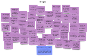
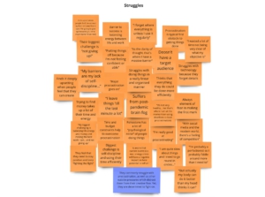
The first step of working with Kate was getting to know her as much as possible. We had a one-to-one video call where I asked her open-ended questions to assess her needs. There were no wrong or right answers to questions such as, ‘How does making art make you feel?’ or ‘What would an ideal day as an artist look like for you?’ but each response gave me insight into her personality, struggles, and goals. By the end of the interview, I had many interview notes, which I grouped into common themes and opportunities.
I used the research synthesis as the foundation for the strategic plan.
Top insights:
- Kate’s fascination with the interplay of light and dark stems from her rural upbringing and affinity with nature
- She has always gravitated towards making art that is respectful of nature and feels that she has a gift for discovering the hidden treasures within it and sharing them with other people
- Kate is resilient. She struggles with various chronic ailments that threaten to derail her creative processes daily, yet she continues to fight on and overcome them
- She was keen to spend less time worrying about sustaining a living and more time creating art and realised she must start reaching a more affluent audience who could afford to buy her art.
These insights formed the basis of the strategic plan to build her website, which outlined her current situation, her desired outcomes, and the steps I would take to get her there.
Design concepts and prototyping
Kate felt uncomfortable using her website to hard-sell potential buyers. Instead, she wanted to create an online portfolio experience where a gallerist or curator would feel motivated to represent Kate based on the strength of the work presented. More importantly, Kate wanted the visitor to quickly see what she does and who she is and feel inspired with hope and wonder.
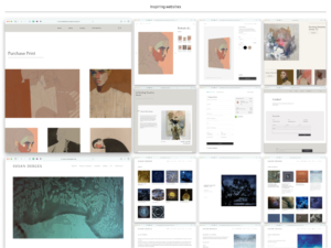
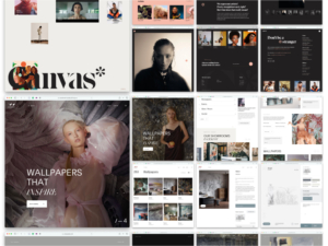
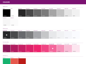
She wanted the visual aesthetic to be minimal, clear, and elegant while emphasising her creations. I created a mood board comprising a collection of artists' websites she admired and inspiring websites, a small selection of her artwork images, web font options, and a basic colour palette based on the hues in her artwork.
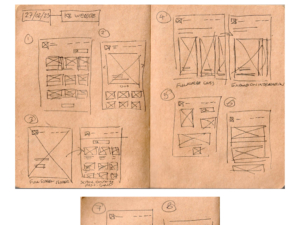
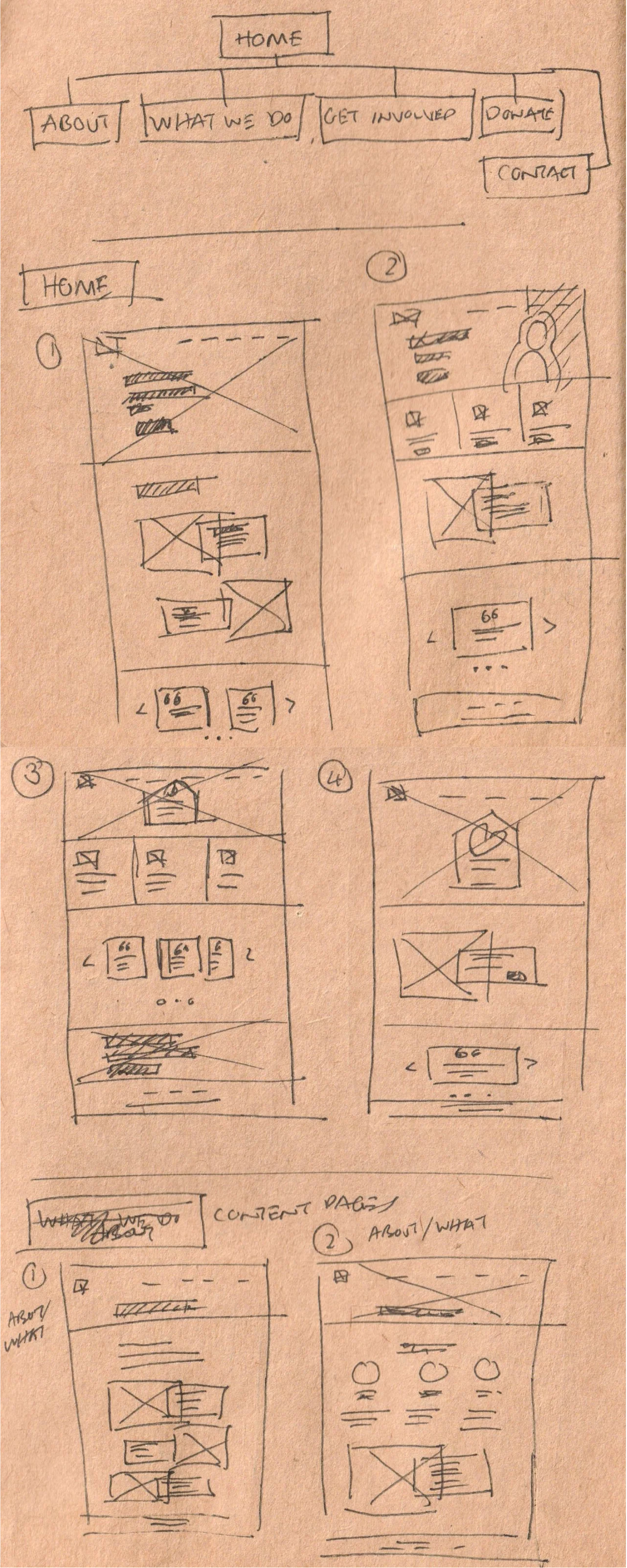
Early sketches briefly explored grid layouts, where pieces of work are represented in card form that the visitor clicks on to explore further. Kate liked this feature, which she spotted on a fellow artist's website.
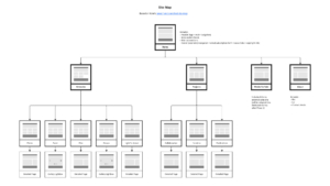
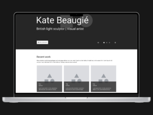
This approach was iterated further using wireframe mockups in Figma, which showed Kate the website's basic structure and layout so that she could get a sense of the big picture without being blinded by details.
I used the foundation of the research to shape the visual concepts and pursued the grid format.
I created a high-fidelity Figma prototype to show Kate the simple flow from the home page to a project detail page.
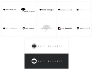
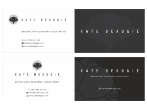
Once we agreed on the structure, we worked together to shape the website's look using a series of high-fidelity Figma mockups, iterating through them to arrive at the final style. Along the way, I also created a logo for Kate to use across the website and printed materials such as a business card. Kate felt the business card was unnecessary for her immediate requirements, so we agreed only to pursue the website logo branding.
Using a Figma prototype, I could simulate a basic navigational experience flowing from the website homepage to a project detail page. Kate and I clicked through it in a one-to-one video call to test the concept. Once Kate approved it, I proceeded with the WordPress build in the Oxygen Builder.
Solution and impact overview
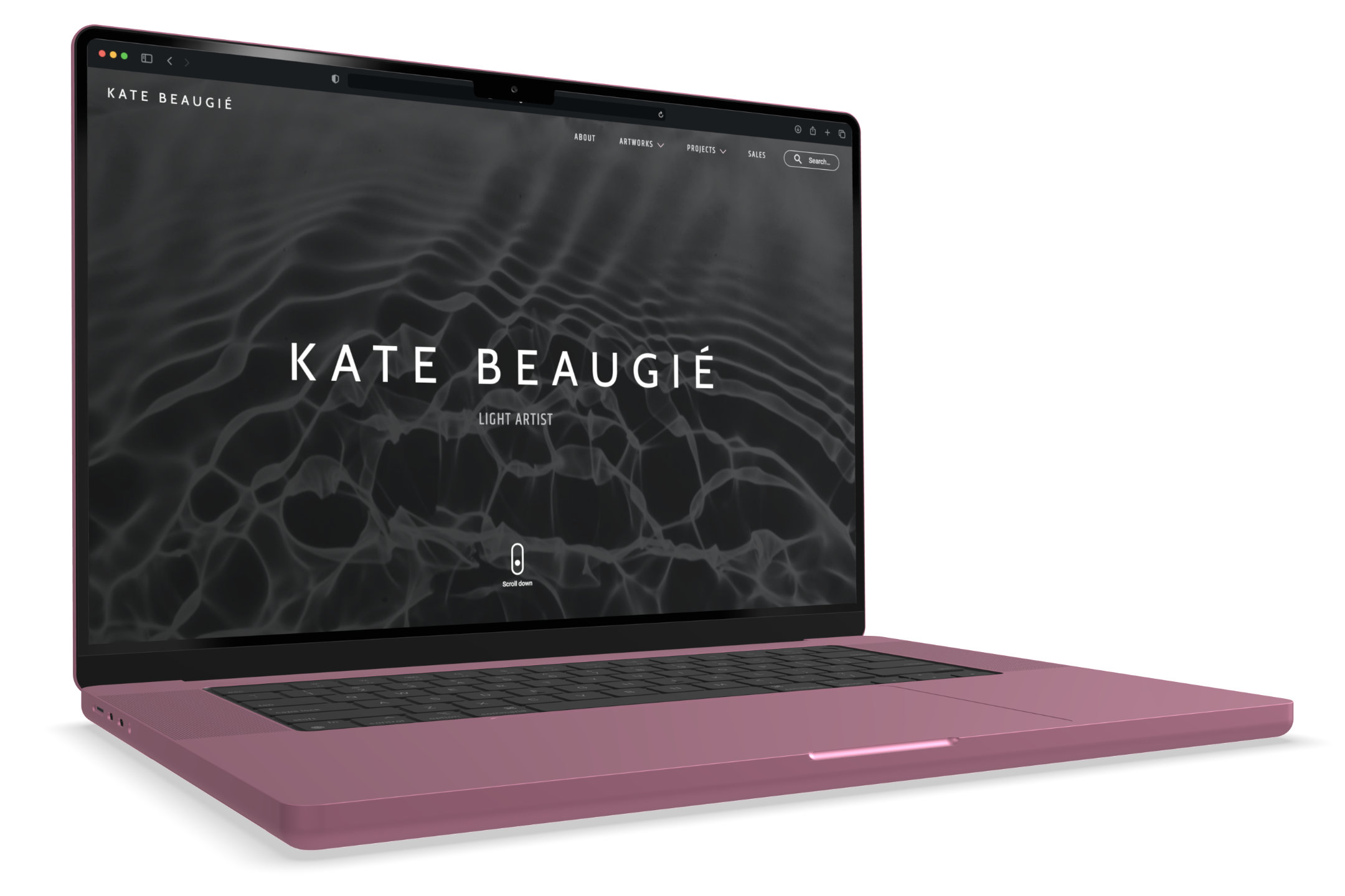
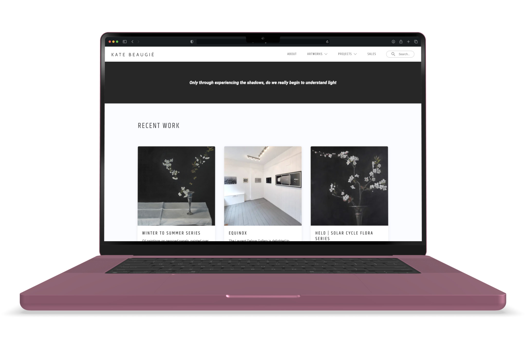
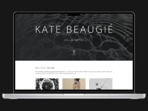
Final WordPress website home page.
Kate was emotional when she viewed the final working version of the website. She was in awe of how I captured the essence of her ethos and art and reflected it back to her in the website design. Kate was highly appreciative of my efforts.
The official website launched at the Autumn Equinox in September 2023. The Autumn Equinox marks the first day of astronomical Autumn, when the sun is above the Earth’s equator, bathing the northern and southern hemispheres in equal amounts of light and dark. It was a very fitting time for Kate to go public with her new website, which has since garnered much praise from her peers, especially from her newly acquired gallerist, Laurent Delaye Gallery in Ramsgate.
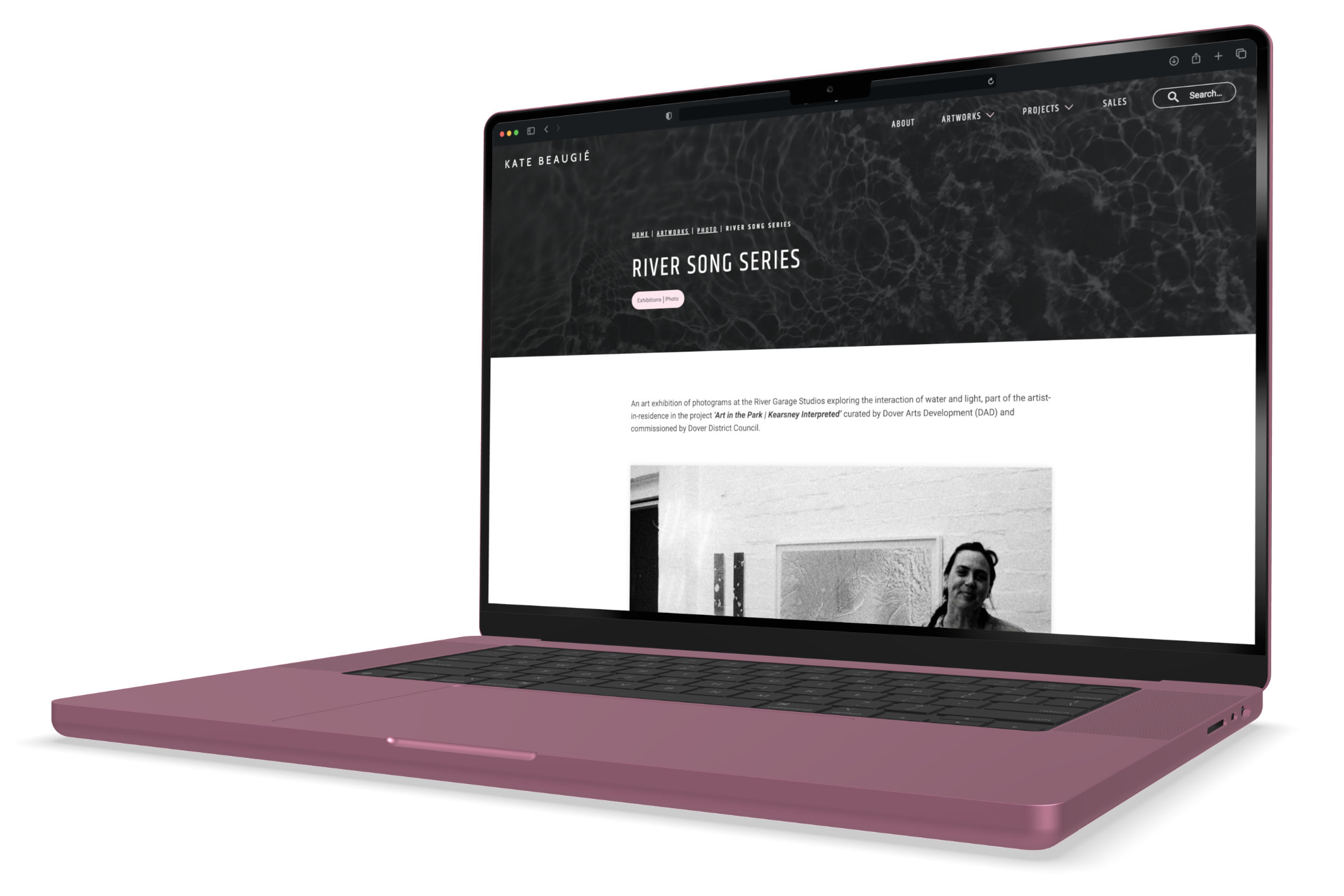
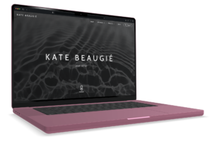
Pages from the final WordPress website.

“My beautiful new portfolio website built with such care, skill, style, elegance and attention to detail by Anthony Browne Creative was launched at the point of the Autumn Equinox 2023 (7.50am BST on 23.09.23).”
Light Artist (posted on Instagram)
Final reflection
It was a pleasure working with Kate. Working with someone with a strong visual aesthetic pushed me to create a better solution to meet her requirements. It is a piece of work that we are both very proud of, and I hope that this website will aid Kate in reaching the next level in her career as an independent artist.
As is often the case, however, there is never enough time to fit all the other things I would have liked.
For instance:
- To enhance the theme of light and dark, an automatic dark theme feature that changes the colour scheme of the web pages to light or dark depending on the sunrise and sunset times of the visitor would have been a nice bonus touch
- Building an e-commerce section of the website would allow Kate to sell smaller artworks to the general public privately.
- Migrating Kate's existing WordPress blog to the website would create a more unified look, expanding the visual style across all her email marketing and social media content.
