

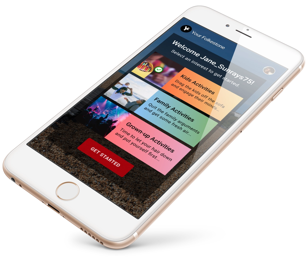
Mockup of the Your Folkestone app on an iPhone 8, which displays the welcome screen.
There’s a saying in User Experience (UX) design: “You are not the user.” It’s a reminder not to assume everyone thinks the way you do. I discovered this first-hand when I enrolled in the Udacity User Experience Designer Nanodegree course during the COVID-19 pandemic.
The course didn’t just teach theory—it threw me straight into a live project, which was a bit daunting initially. I had to come up with a real-world idea to put all the UX principles into practice.
As a parent in Folkestone, I often wished for a way to quickly and easily find local family-friendly events without trawling through multiple websites, social media pages, and newsletters. This frustration inspired the idea of an app to centralise all this information. I just needed to find out if other parents agreed.
Diving into research (at a safe distance)
If there’s one thing you should know about me, I’m a quiet introvert. So, recruiting real people for research during a global pandemic was a challenge! However, with the help of digital tools like Google Forms and Zoom, I surveyed and interviewed other parents in Folkestone to see if they faced the same frustrations that I did.
Talking to people wasn’t as bad as I had feared—most participants were friends or acquaintances. However, reaching out to people was still challenging, especially in the age of social isolation. The research showed that parents relied heavily on word of mouth to find out what they needed, and many were out of the loop because they avoided social media. The feedback was clear: 93% of parents thought a single app to find all event information would make their lives easier. My idea wasn’t just something I wanted; it was something many parents in the area also needed.
Designing, testing, and iterating
With the insights gathered, I started sketching ideas for the app. It had to be visually appealing, simple, and not overwhelm users with too much information. I focused on critical features like event filtering, weather updates, and tailored content, all designed to make parents’ lives easier.
After creating wireframes (structural representations of the app screens) and high-fidelity mockups (visualisations of what the app screens would look like in real life with full colour, images and readable text), it was time for usability testing. This was nerve-wracking! Would the app make sense to them? Would they get stuck, thinking it was real and not a mockup? Some users breezed through it, while others hit roadblocks—like getting stuck in a loop between the sign-up and welcome screens. ‘Ahha!’ moments like this made me realise how valuable user testing is for spotting those small but significant oversights.
The final solution: Your Folkestone
After several rounds of usability testing and design iterations, I arrived at the final concept: Your Folkestone, a local community events app inspired by the vibrant colours of Folkestone’s Creative Quarter. It is designed to ease the frustrations of busy parents trying to plan family activities during weekends and half-term holidays.
My key takeaway from this course was that designing with the user in mind, not my assumptions, is key. Some assumptions were validated, but others were proven wrong, like neglecting error reporting on the sign-up screen. It’s through this iterative process that a truly user-friendly product emerges.
Looking ahead
Completing this project during the pandemic pushed me out of my comfort zone, but I’m better for it. I’ve integrated the UX tools I learned into my web design work, helping me create better, user-centred solutions for my clients.
If you need help making your business stand out with a unique, user-friendly WordPress website, I’m here to help. Let’s schedule a call and see what we can create together.
Udacity User Experience Nanodegree certificate of completion.
