Contents
Challenge: Creating an easier way to find local events
As a parent, finding family-friendly events in Folkestone was frustrating. Information was scattered across multiple platforms, making the process tedious and time-consuming.
Folkestone is a small town on the southeastern coast of England. Although small, it is bustling with with things to do and see, largely thanks to its growing community of creatives. However, I often struggled to find things to do with my family when searching online. Searching for activities involved checking multiple websites, Facebook groups, and newsletters. This inefficiency made me wonder if other parents shared the same frustration. So, I set out to validate the need for an app that consolidates all local family events in one easy-to-use place.
Research: Validating the problem
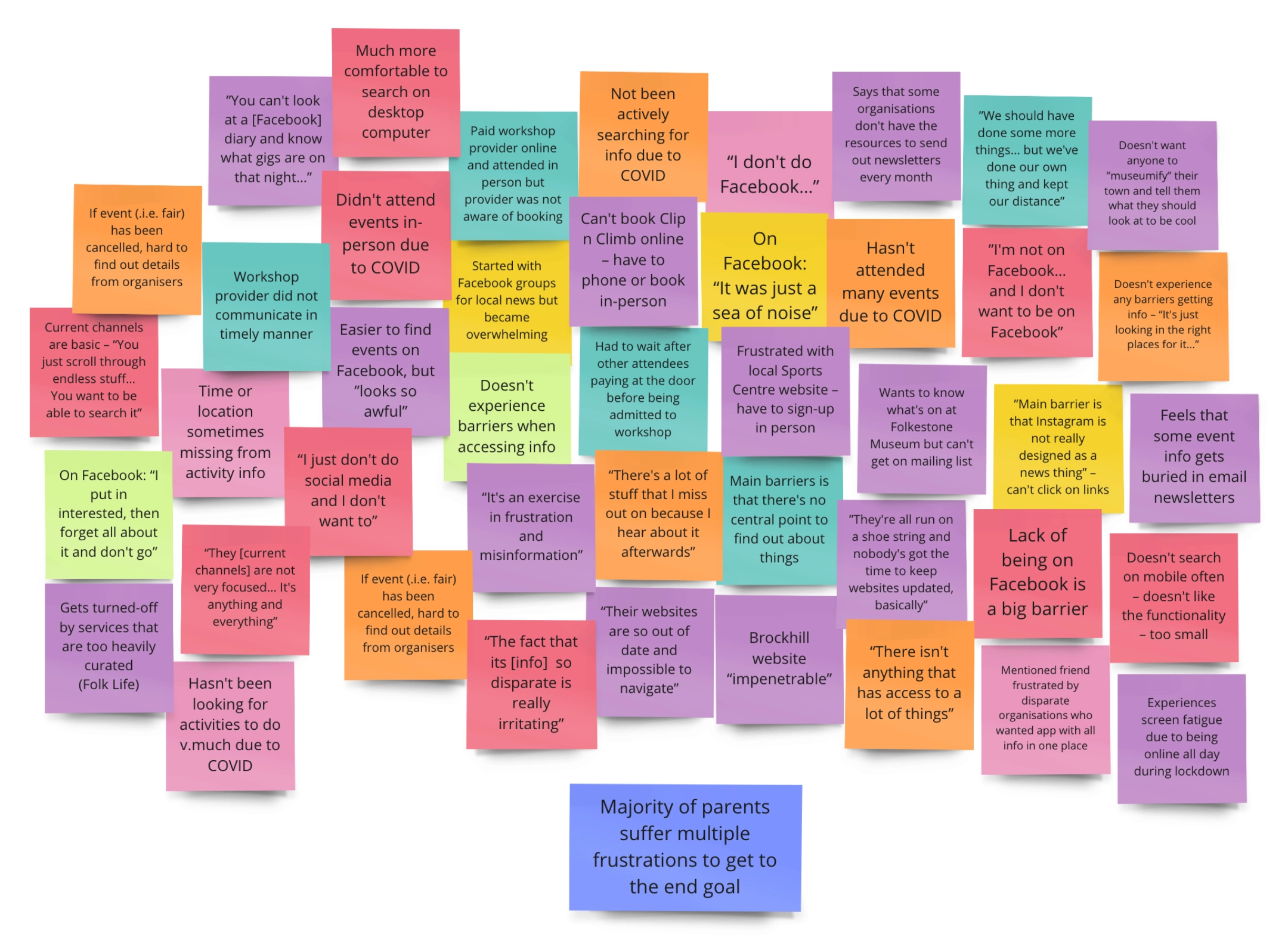
Through surveys and interviews with local parents, I discovered a clear need for a centralised app. Most parents faced the same hurdles, relying on word of mouth or scattered digital platforms.
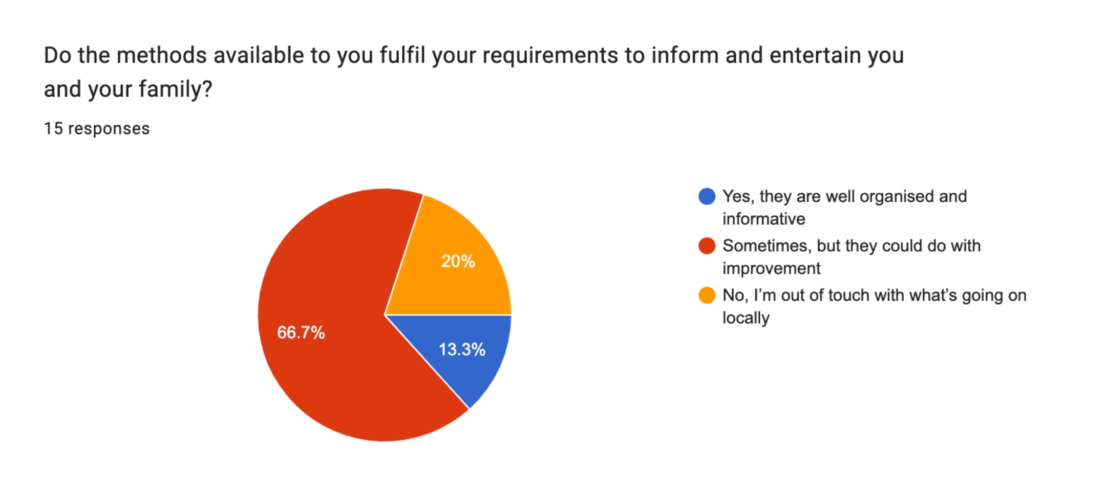
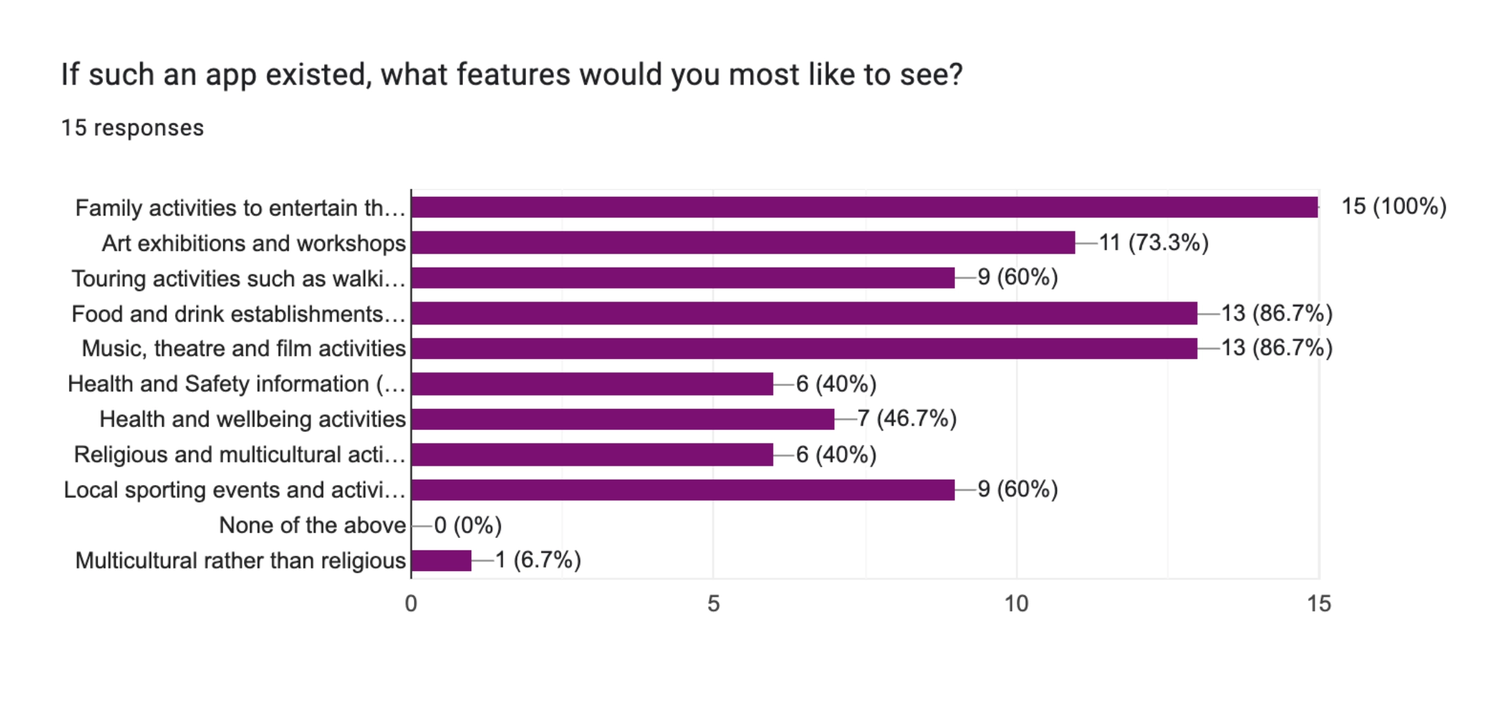
I conducted a screening survey and follow-up interviews with parents in the Folkestone community. Key findings included:
- 100% of participants said they relied on word of mouth to discover family activities
- 93% expressed that having a single app to find all event information would make their lives easier
- 29% of parents avoided using social media platforms like Facebook for event searches, relying on more traditional methods instead.
User research survey results and research synthesis boards.
These insights confirmed that a consolidated event app could significantly reduce the effort parents expend in finding activities for their families.
Concepts and design: a simple, visual, and user-friendly approach
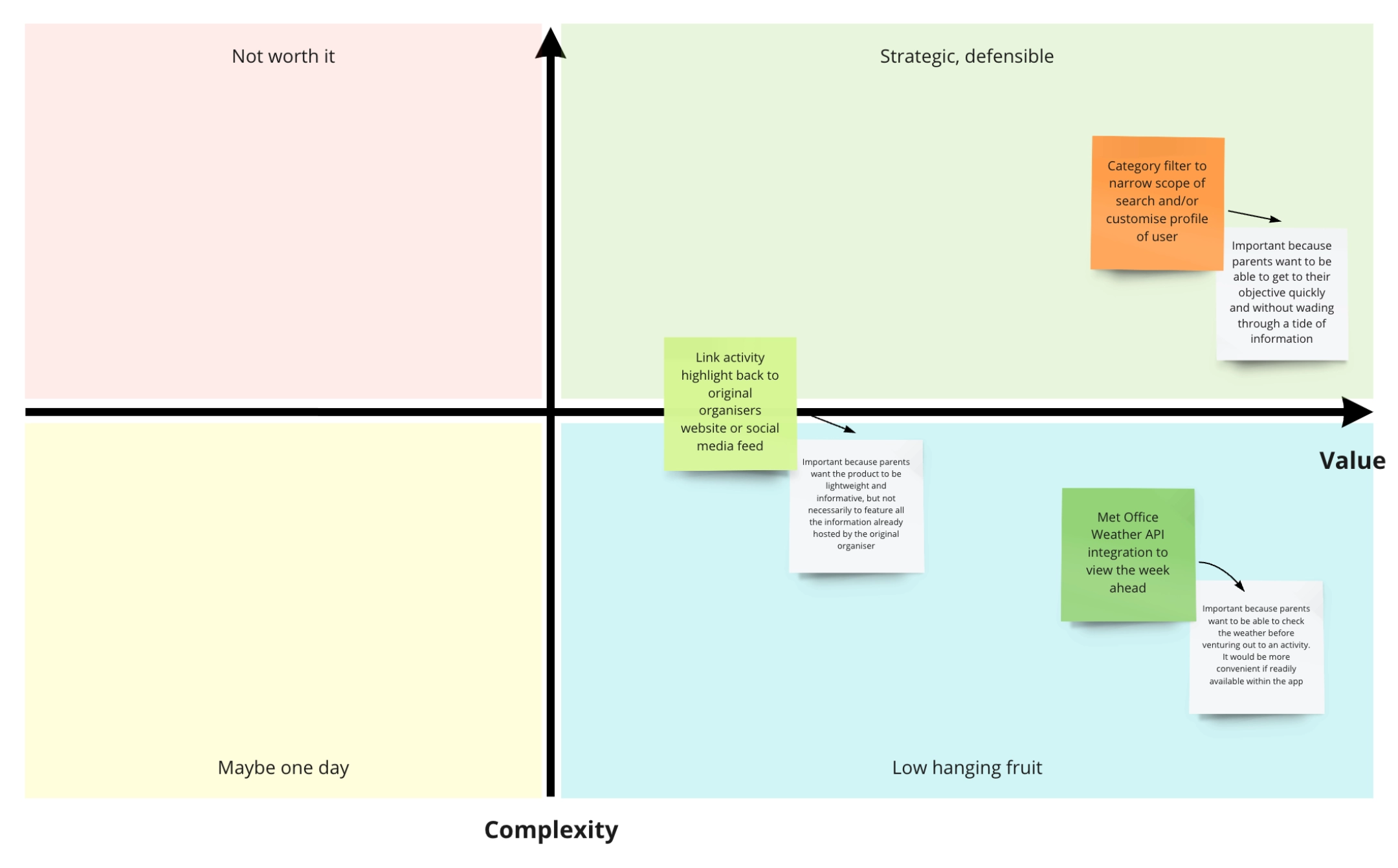
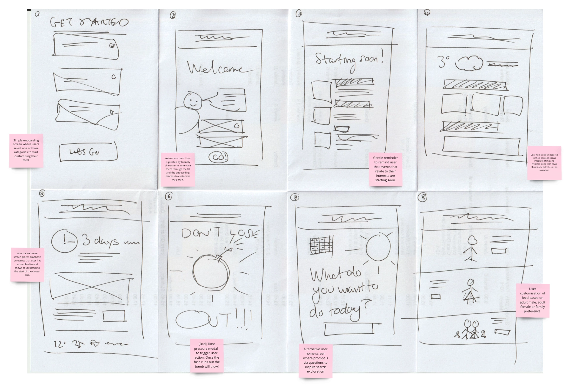
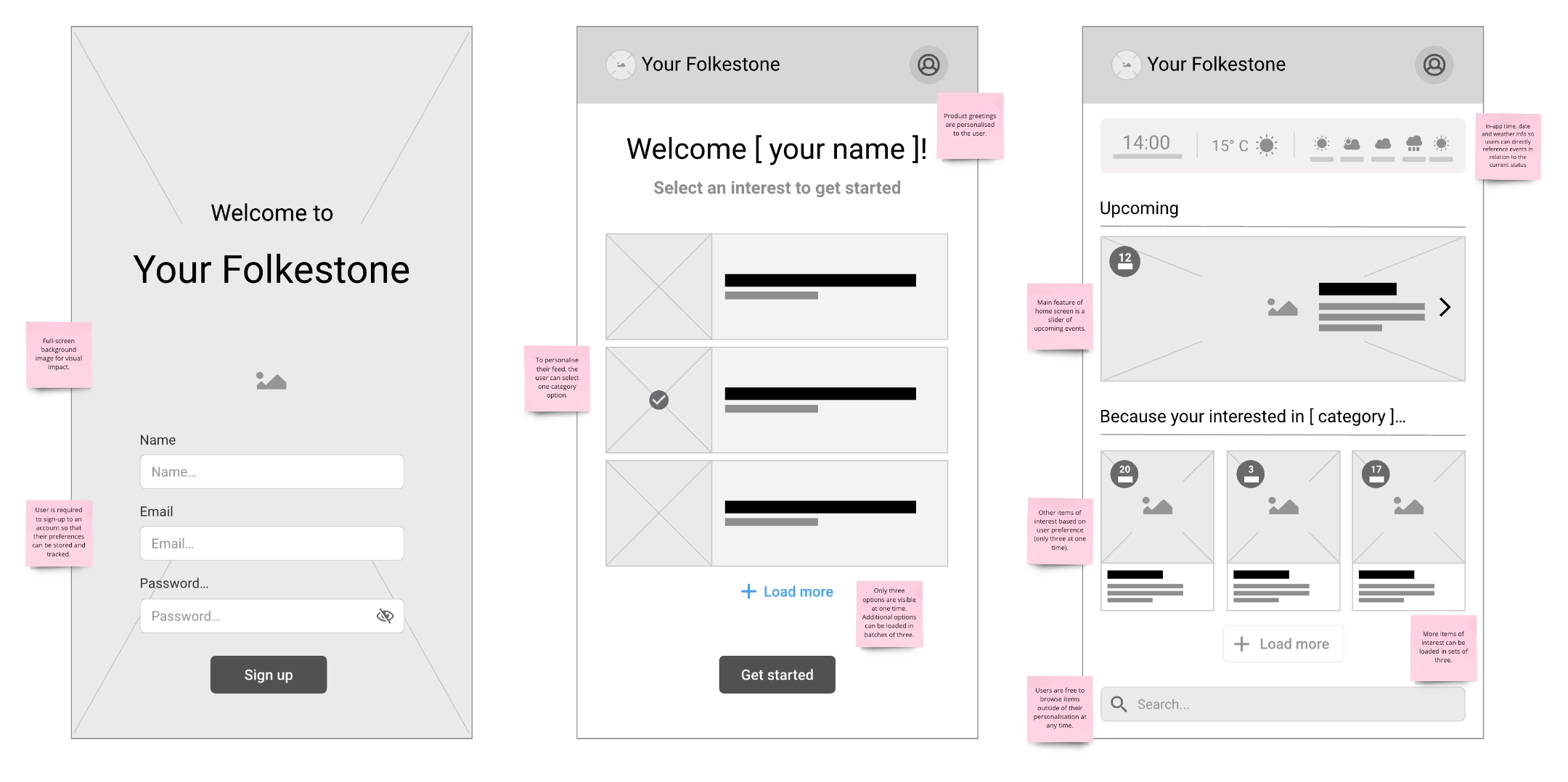
Parents wanted an app that was highly visual, simple to navigate, and prevented information overload. I sketched concepts to meet these needs and refined them into wireframes.
Based on user feedback, I focused on key features like weather notifications, event filtering, and tailored content to minimise excess information. My sketches explored different ways for users to quickly find events that suited their needs. The priority was to keep the interface clean and intuitive while also allowing for event categories and details to be easily accessible.
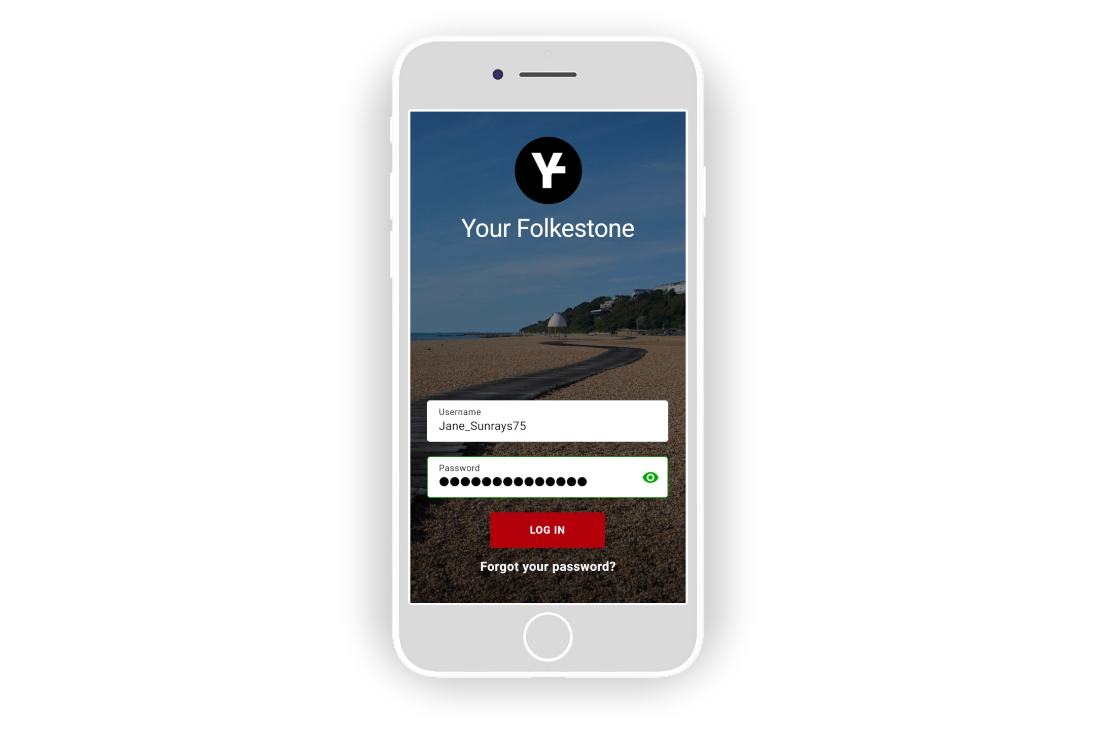
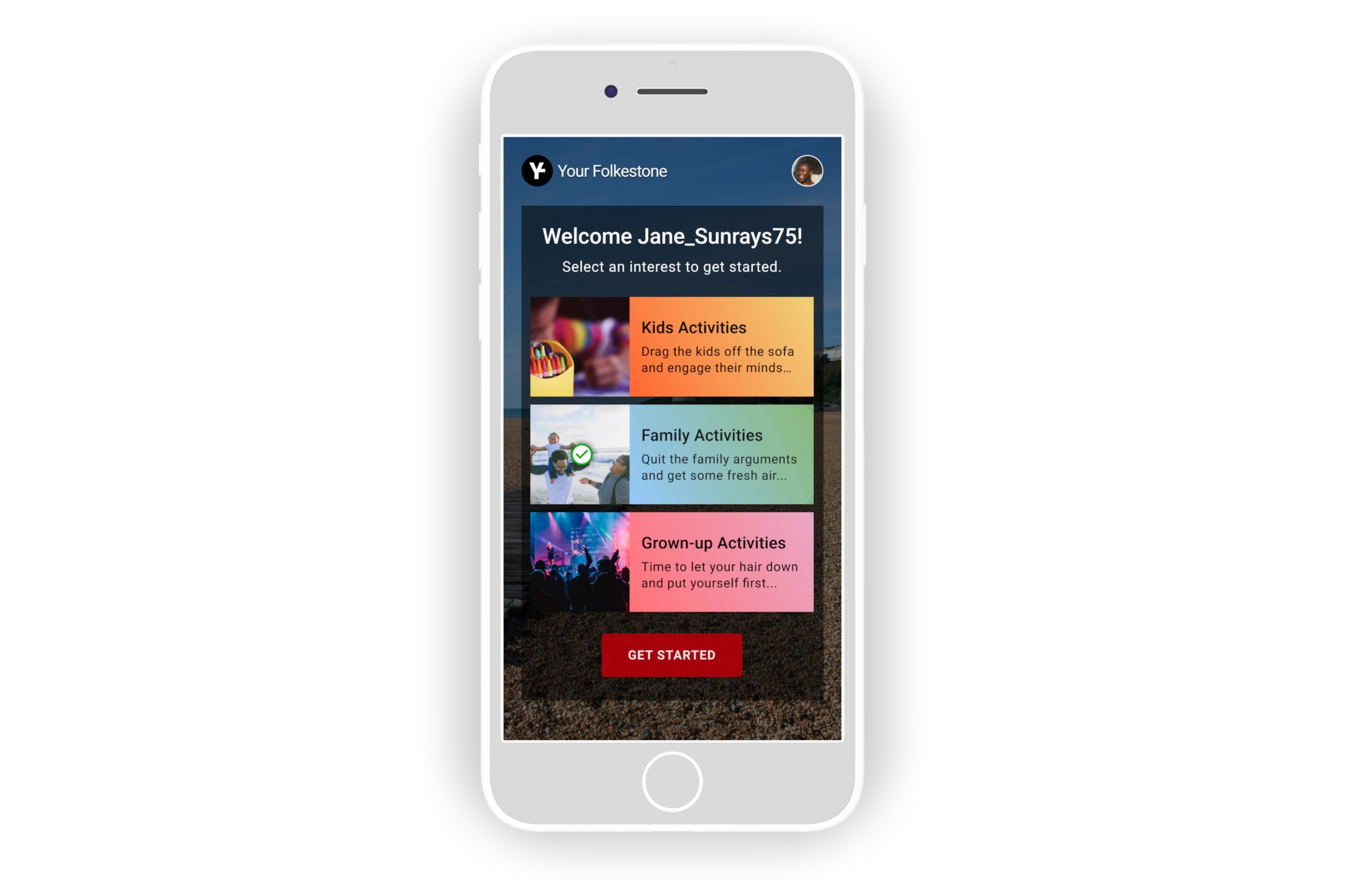
The ideation process, from paper to Figma mockups, focused on the user flow from the sign-up/sign-in screen to the app home screen.
Prototyping and testing: Iterating for better usability
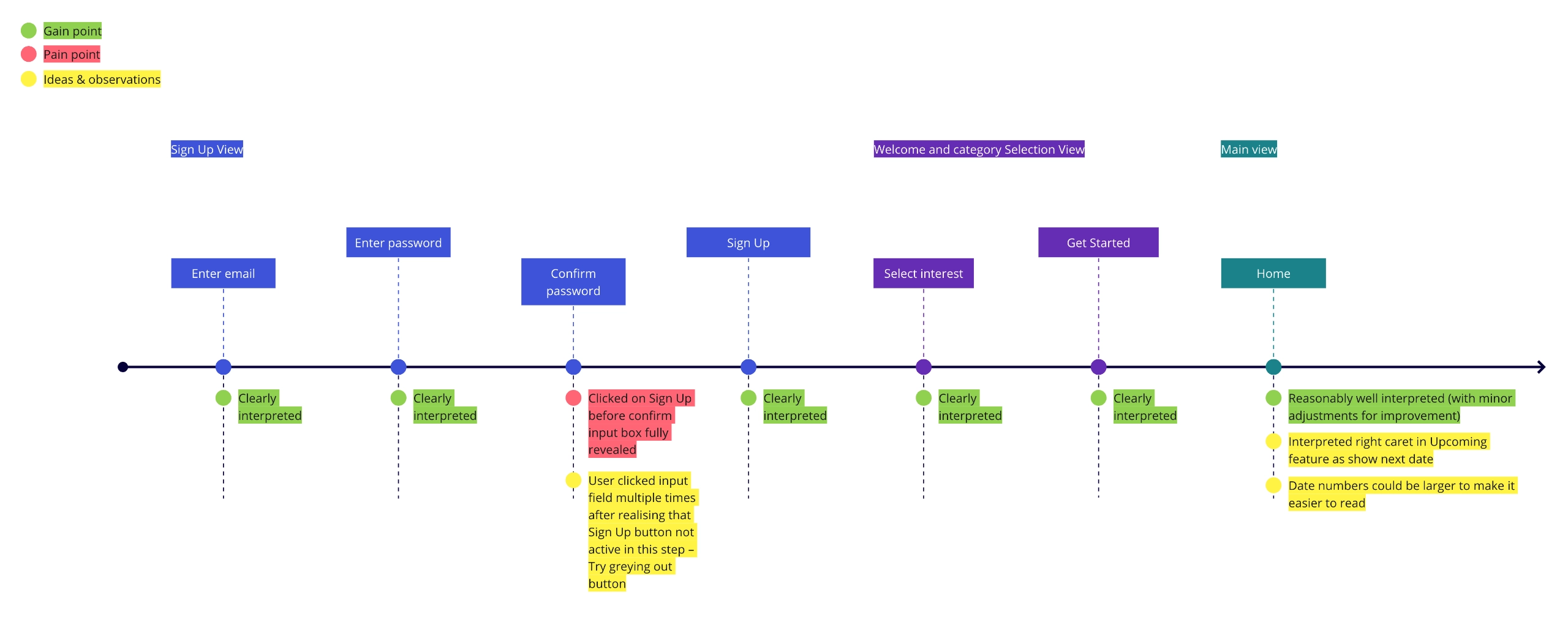
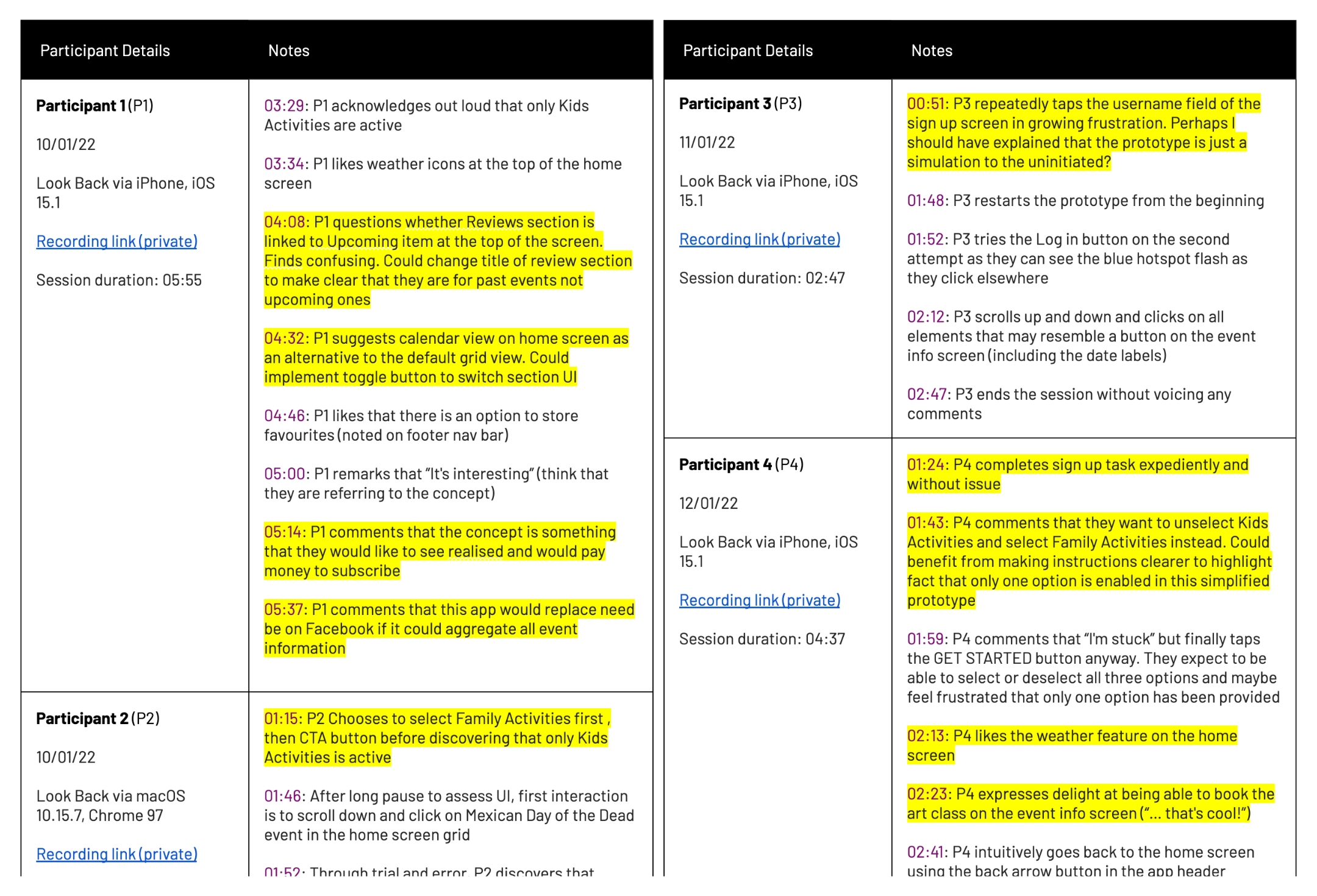
After creating wireframes in Figma, I conducted both moderated and unmoderated usability tests. While some users found the prototype easy to use, others ran into issues, which led to significant iterations in the design.
During testing:
- 43% of users found the high-fidelity prototype engaging and easy to navigate
- However, 25% of users got stuck in the user flow due to limited navigation options, highlighting areas that needed improvement.
To address this, I made crucial updates like adding error messages, expanding event options, and improving menu visibility. These changes helped smooth out the experience and made the app more user-friendly.
Unmoderated prototype testing led to further iterations of the design to make it more user-friendly.
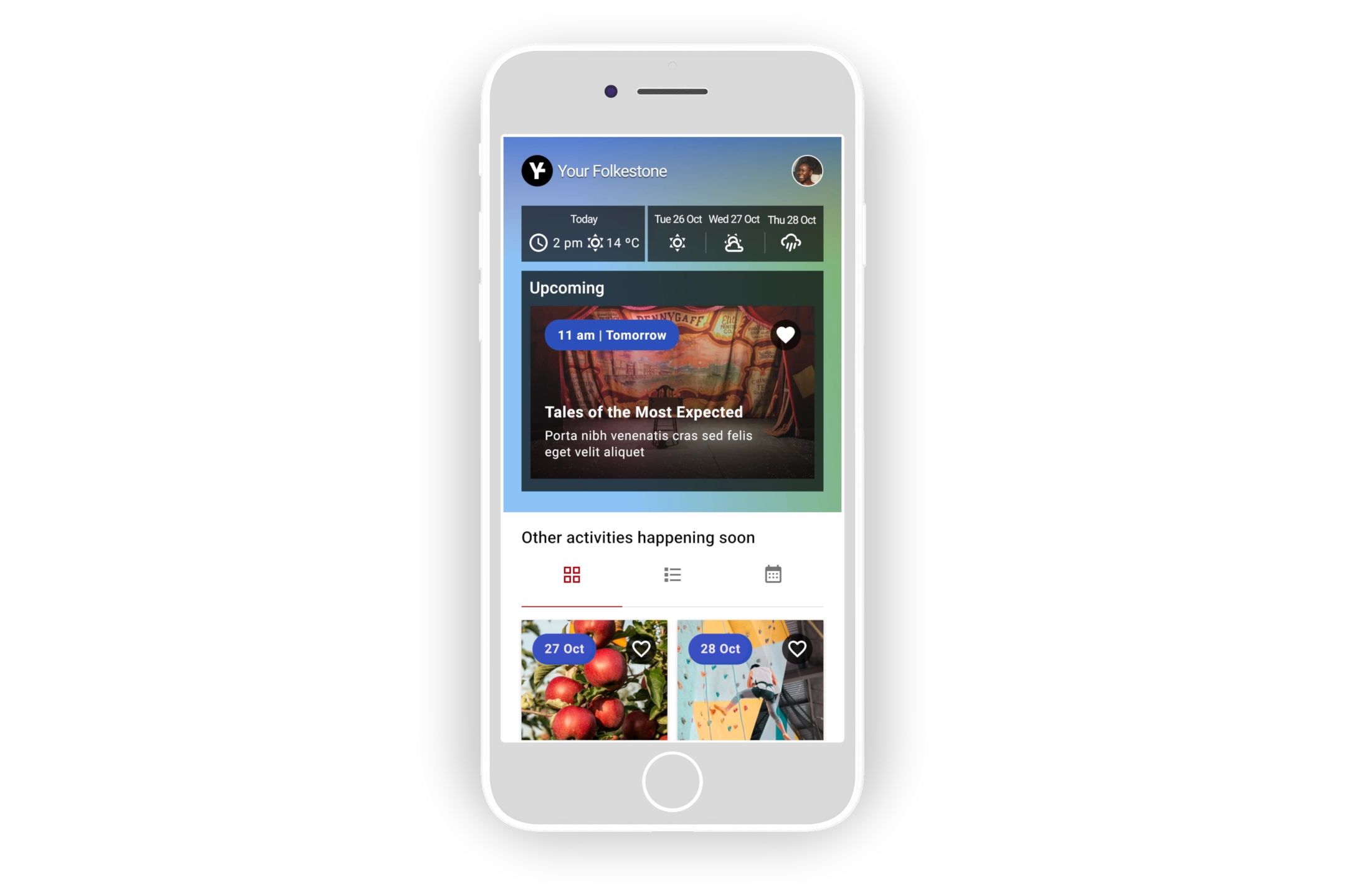
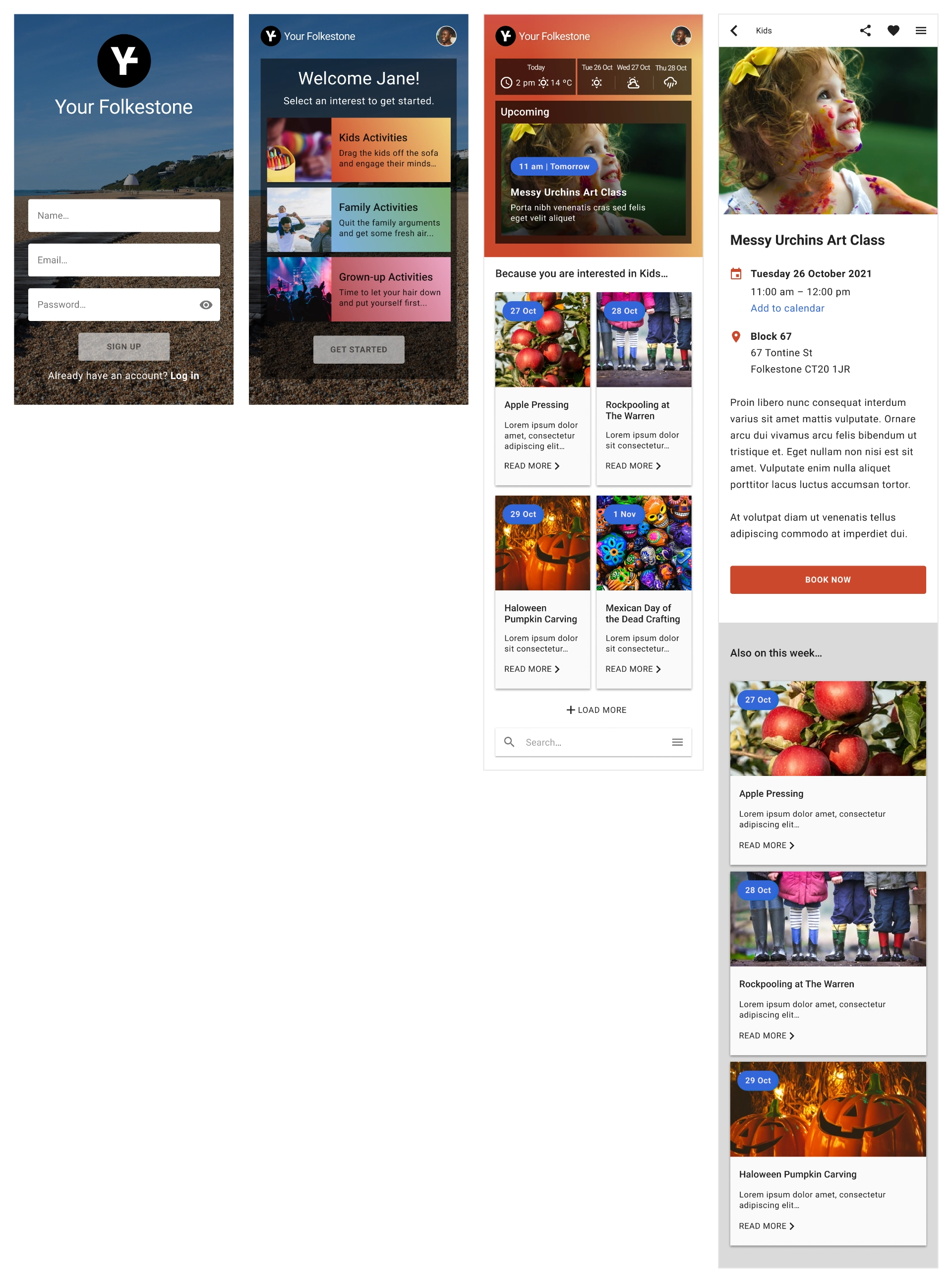
The final iteration of the high-fidelity prototype.
Final iterations and outcome: A user-centred solution
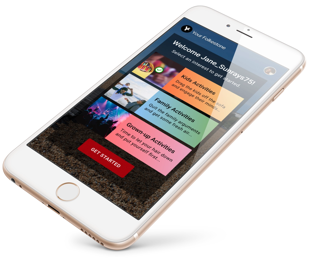
Mockup of the Your Folkestone app on an iPhone 8, which displays the welcome screen.
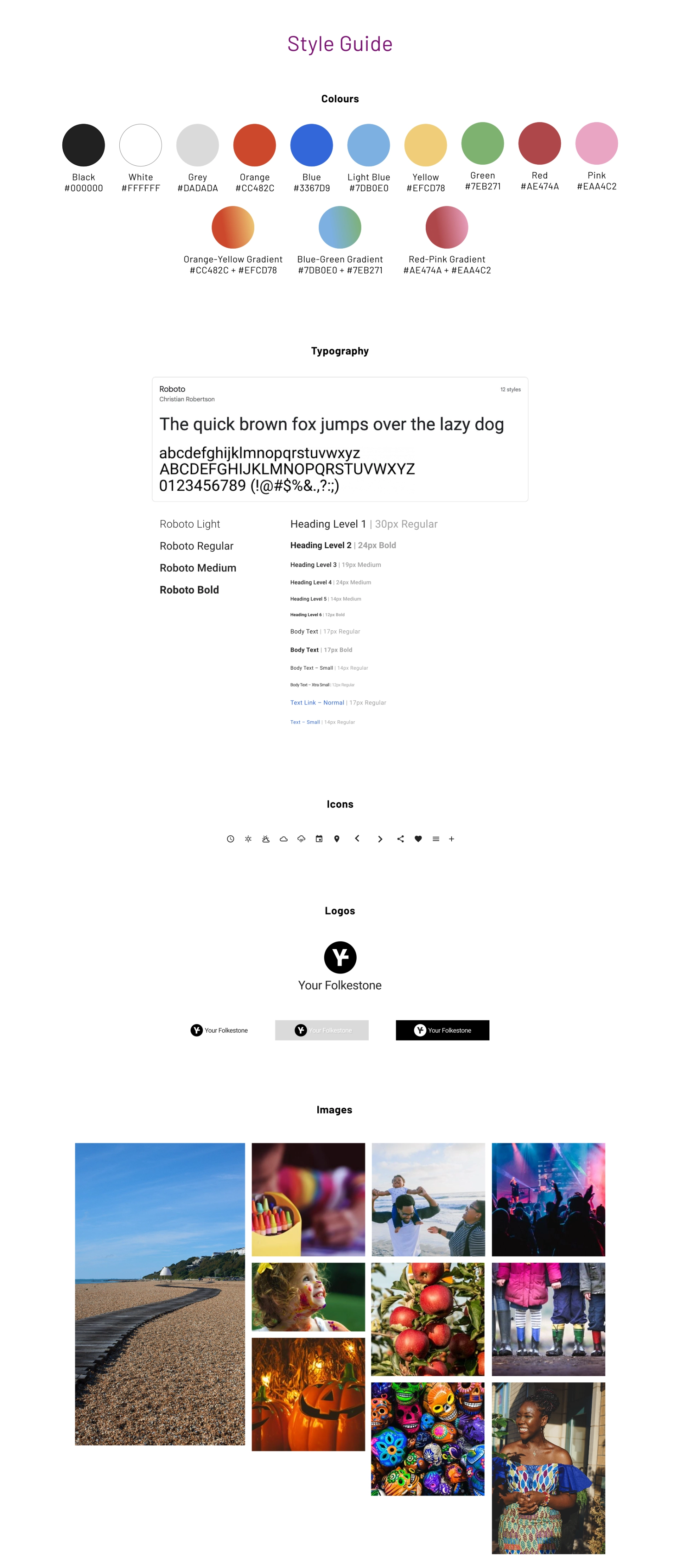
The final design catered to parents' needs by offering an accessible, colourful interface inspired by Folkestone’s vibrant seafront and Creative Quarter. The app provided a central hub for event discovery, making it easier for parents to plan family activities.
After multiple iterations, I refined the prototype to improve accessibility and navigation. Updates included a more prominent menu, error messaging, and additional viewing options for events (grid, list, calendar). While the app is still a concept, the positive feedback from parents has validated its potential to make their lives easier by consolidating event information into a single platform.
Final Reflections
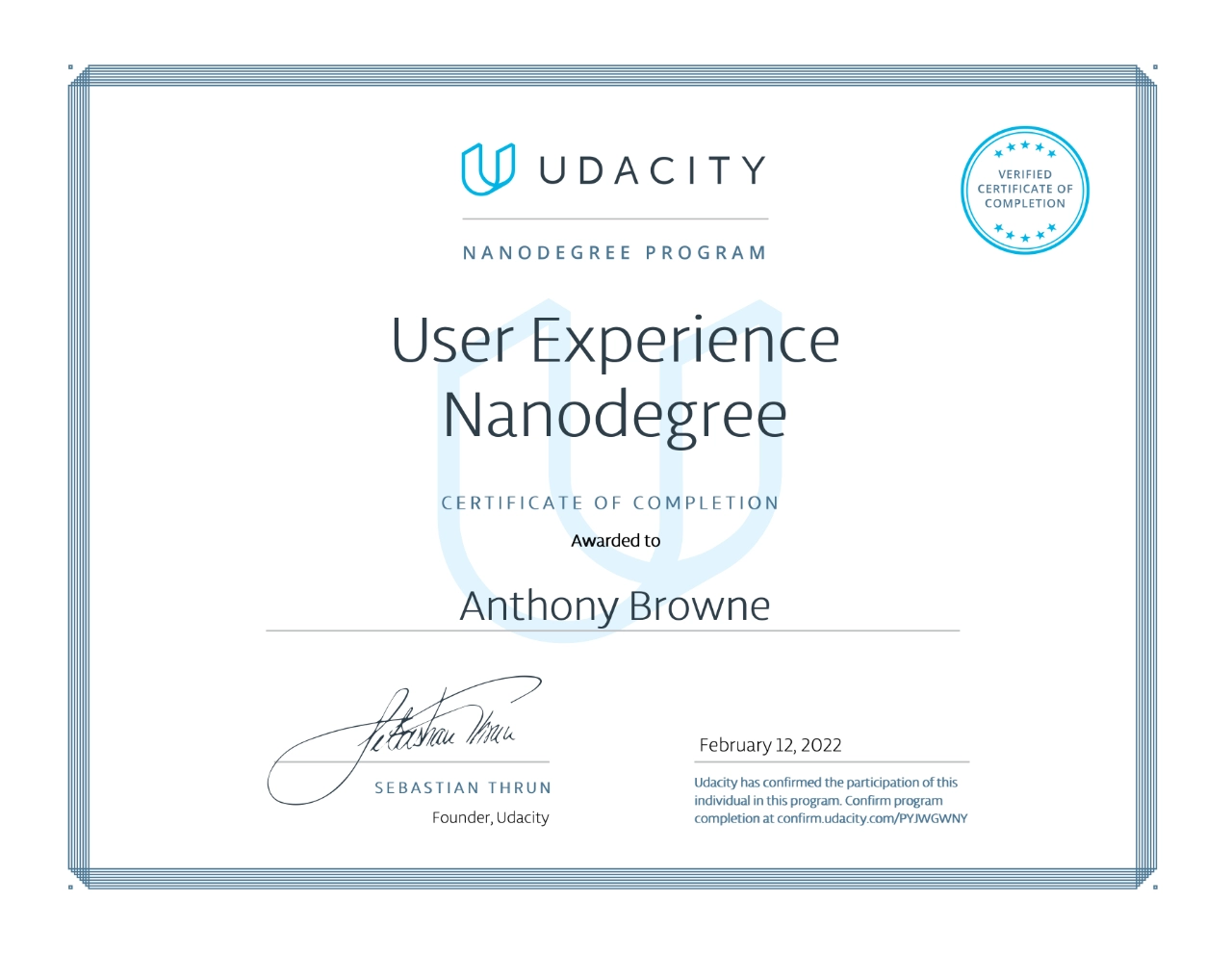
Udacity User Experience Nanodegree certificate of completion.
This project started as a personal pain point and evolved into a user-driven design solution. It not only confirmed the need for an app but also showcased the power of iterative design in solving real-world problems.
This was the first time I moved through the entire UX process, and it solidified my passion for creating thoughtful, user-centred solutions, sparking a desire to explore this discipline further. I believe I can bring this problem-solving approach to new challenges, creating impactful solutions for users and clients alike.
